In the world of branding and custom printing, mastering design principles is essential. As stated by principles design, Design Principles are guidelines that empower a team to make wise decisions and appropriate trade-offs when designing, building, and innovating. Whether you're creating social media graphics, custom business cards, or branded packaging, knowing how to apply the core elements and principles of design will help your brand stand out. In this blog post, we'll walk through seven foundational design principles—contrast, balance, emphasis, proportion, repetition, movement, and white space—and how you can use them to elevate your brand identity.
1. Contrast
Contrast adds visual interest and directs attention. In design, contrast is created through differences—light vs. dark, thick vs. thin, large vs. small. Your choice of contrast and color shouldn’t be arbitrary—it should reflect what your brand stands for (Toptal). Using high contrast in your business cards or social media posts ensures that your message pops. Great color combinations are a simple way to use contrast effectively while maintaining brand cohesion.
Tip: Combine bold fonts with subtle icons for a memorable brand look.

2. Balance
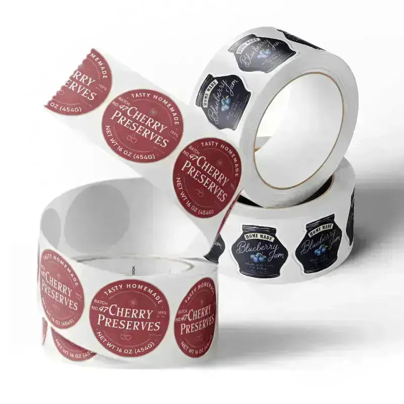
A balanced design feels stable and harmonious. As Kittl (2024) notes, balance helps to create a sense of harmony within a design, making it easier on the eyes and more visually appealing. Balance can be symmetrical (equal on both sides) or asymmetrical (different elements that still feel evenly distributed). When designing branded elements like labels or stickers, maintaining balance helps reinforce a sense of professionalism and consistency in your brand identity.
Tip: Use grids or alignment tools when creating custom prints to keep designs clean and organized.
3. Emphasis
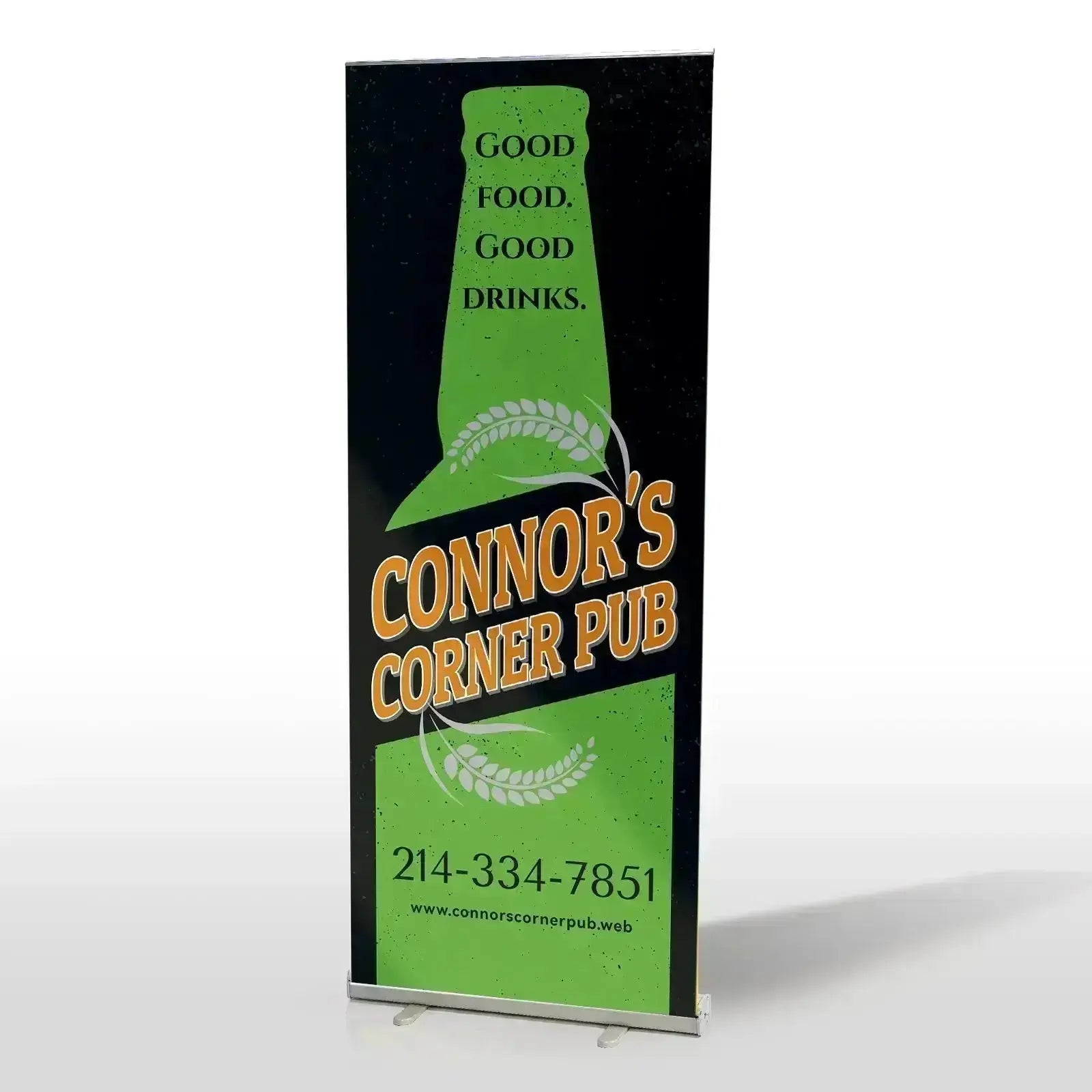
Every design should have a focal point—this is where emphasis comes in. Emphasis ensures the most significant message (a call to action, your brand name, or a promo detail) grabs attention first. For example, in a flyer design, you might use bold typography or a high-contrast shape to draw the viewer’s eye.
Tip: Keep one main focus per design to avoid overwhelming your audience.
4. Proportion
Proportion refers to the relative size and scale of elements. It plays a crucial role in maintaining harmony, hierarchy, and legibility across all your visual materials. When proportions are off—such as a logo that's too small to notice on a business card, or text that overwhelms the layout—your message can become diluted or confusing. Carefully considering proportions ensures all parts of your design work together.
Tip: Prioritize clear hierarchy when sizing design elements—the most crucial message (like the brand name or call to action) should be immediately visible without overpowering useful details.

5. Repetition
Repetition is one of the most effective design principles, helping to build familiarity and create a cohesive, professional look (Zeka Graphic). Repeating certain colors, fonts, icons, or layout styles across materials (stickers, labels, and social media posts) builds a cohesive visual system. This consistency makes your brand more recognizable and trustworthy.
Tip: Develop a style guide to keep repetitive elements consistent across print and digital.
6. Movement
The principle of movement in design refers to the intentional arrangement of elements to guide the viewer’s eye smoothly through the visual layout. This doesn't mean animation—it's about layout flow. For instance, a diagonal line or curved text might guide the eye from your logo to a call to action. Thoughtful composition ensures your message is seen in the right order.
Tip: Use arrows, shapes, or image direction to lead visual flow.
7. White Space
Also called "negative space," white space is the area between design elements. The most important function of white space is to provide space for design elements to "breathe" (Toptal). It prevents clutter and gives each element room to stand out. In packaging or business card design, effective use of white space makes your content feel premium and intentional.
Tip: Embrace space—clean, uncluttered layouts often appear more refined and professional.
Conclusion
Design isn’t just about making things look good—it’s about making your brand work. They aren't rigid rules—they're tools to help you create intentionally and effectively. Use these design principles to craft print materials that express your brand, connect with customers, and make a lasting impact. Whether you're designing for digital or physical media, understanding the elements of design and principles will improve everything from color combinations to layout choices.
Ready to bring your brand to life? At RacetopPrint, we specialize in custom, small-batch printing for all your needs—from disposable cups to bags. Explore our design services and see how smart design can grow your brand.
